Just a few short weeks ago, I was in a store that had HORRIBLE signage. I decided then and there that I was going to give you all ideas – on how NOT to make the same mistakes. Then the next day, I opened my email and saw that my friend, Bob Negen, had already done that. 🙂 So I asked if I could share it with you all – and he said yes! Let me know here on Facebook which tip you liked the best. My fav tip is to make sure that every sign has a BENEFIT headline!
Tip #623 – Your Silent Salespeople
Great signage is one of the easiest ways to answer the customer question, “Do they have what I want to buy?”
The words you choose and the color, font, texture, and shape of your signs will all help your customer know more about what they can expect to find in your store and if it’s going to be a fun shopping experience.
“Item signs” are small signs about a single item or a group of items, placed adjacent to the item. These are mini in-store advertisements!
Great item signs will increase your sales, guaranteed. In fact, signs are one of the most important, least expensive sales and marketing tools you have at your disposal.
Signs Can Turn Browsers into Buyers!
- Item signs act as mini “salespeople” to customers who are too shy to ask questions.
- Signs make your merchandise more attractive to customers by highlighting interesting features, hidden benefits, or outstanding values even if the merchandise isn’t “on sale.”
- Signs can showcase merchandise you are particularly eager to sell – because of overstocks, great margins, or items that are season sensitive. In other words, item signs can make your customers “eager to buy!”
Design Your Signs
Anyone with a computer and printer can make great signs. Designing them is easy if you keep in mind some simple points:
- Make sure signs are easy to read and not overly complicated.
Use fonts that are plain and not too fancy to read. Pick one or possibly two font styles that you’ll use on all your signs.One font style may be for your headlines (fancier, or bolder) and pick a coordinating font that’s easy to read for the sign content.Keep your font style, size, and color consistent for all your item signs. Consider using a special sign design for the holiday season. Something simple like a red border can dress up a holiday item sign. - Choose ink/paper colors with high contrast.
A white background always works well and can handle many colors of ink; but if you choose a colored background, it’s probably best to stick with black text.
ALWAYS have a benefit headline for every sign!
Sometimes the benefit is the sale price like those standard 25% OFF signs, but often there is an actual benefit of the product, not just a price, that is worthy of a sign.
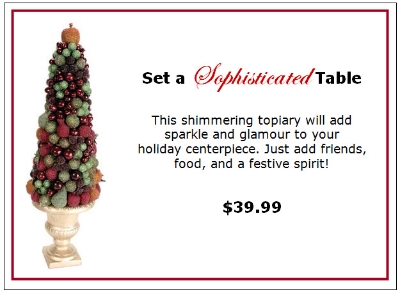
Follow up with some additional information and possibly the price. A picture is sometimes nice so customers know exactly which merchandise the sign is for.
Some holiday signs you may want to consider are:
- Key holiday items – Showcase your holiday themed items and your holiday “must-haves” with good signage.
- Key price points – Often holiday shoppers will come into your store with a certain price point in mind. Make it easy for them to shop by highlighting key price points in your signs.
Here’s an example of a great holiday item sign with an image of the product, a headline, body text, and an easy-to-read price point:

Display Your Signs
Put your signs in sturdy, good-looking sign holders. This will help protect your signs from undue wear and tear and can also draw your customers’ attention to the signs. Sign holders can come in many different forms and can be as basic or as creative as you want.
Have fun with your signage and put your silent salespeople to work this holiday season!
Bob and Susan Negen from WhizBang! Training help retailers get the critical business skills they need to run successful stores. You can Subscribe and get great business building Tips for retail store owners. They really are shortcuts to retail success!

